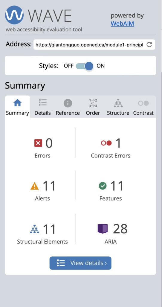
WAVE accessibility check of Blog1 post :
Reflection:
Module 4 examined the interrelationship between media inclusivity, design elements, and ease of access. This module equipped me with critical aspects, such as understanding that creating inclusive and accessible materials is a continuous process that has been rewarding despite my challenges. For instance, I’ve always assumed that as long as the layout and design of a blog are user-friendly, they can access my blog easily. However, after running the WAVE accessibility tool, the evaluation revealed several areas I had previously overlooked for improvement. One of the most surprising points was the need to provide descriptive alt text for images. I had always assumed that simply adding the image would be sufficient, but the tool clarifies that alternative text is critical for users who rely on screen readers. Alt text helps to describe the content of the image, providing visually impaired users with context for the image, which is critical to improving the accessibility of the site. Sufficient color contrast between the text and the background also stood out during the analysis. Before using WAVE, I had not paid close attention to the impact of color choices on accessibility. The tool highlighted areas of insufficient contrast, making it difficult for visually impaired users to read the content. Now, I realize the importance of ensuring sufficient contrast to improve readability for all users, regardless of their visual abilities.
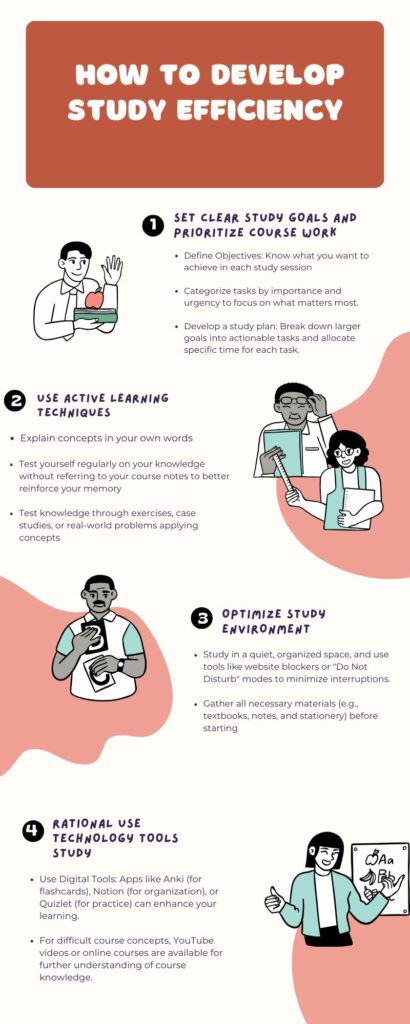
Canva Infographics post on how to develop study efficiency:
Reflection:
After working with Canvas, I found that it offers a variety of elements, such as icons, charts, and text styles, that I use in various ways to create clear, engaging visuals. Whether it’s through custom color schemes, interactive elements, or dynamic layouts, Canva allows me to create infographics that are informative and engaging for the viewer. The limited color palette, alignment, and contrast within Canva are vital in enhancing the visual appeal and clarity of the content. By carefully choosing a color palette that aligns with the theme and purpose of the infographic, I can help ensure that the design remains consistent and easy to understand. The use of alignment ensures that elements are arranged in a way that effectively directs the viewer’s attention.
Additionally, contrasting colors and fonts can strategically emphasize essential information, making infographics more impactful and memorable. These principles are rooted in the Universal Design for Learning framework, which emphasizes creating accessible and engaging content for diverse learners. Additionally, the Canva templates have been critical in streamlining my design process. They provide a solid foundation for my work and allow me to focus on customized design.
Hi! I really agree that alt text and color contrast are often overlooked, but they are crucial for ensuring your blog is inclusive. By adding descriptive alt text, you’re making your content accessible to visually impaired users, and improving color contrast ensures that everyone can easily read your content.
Hi!
I really liked the infographic you created. I think the alternating symmetry of key points on left-right sides makes it very easy to read and follow, and the matching color palette lends to this as well. The consistent design of your infographic is great for accessibility.
Great work!